
Visualising People Analytics for Decision-Making

There's something captivating about narratives that engage us, persuade us, and leave a lasting imprint on our memory.
In their book "Made to Stick: Why Some Ideas Survive, and Others Die," brothers Chip and Dan Heath share a telling statistic:
After a presentation, 63% of attendees remember stories. Only 5% remember statistics."
This is why data-driven storytelling is so powerful. You could have the most reliable, relevant and timely data insights to support your strategic decision-making. Still, you risk losing interest and buy-in if you don't have the storytelling skills to enhance your communication skills. This is why storytelling skills in HR are such an important attribute for driving actionable business outcomes.
Insight222 research echoes this sentiment, showcasing the vital role of storytelling in HR. Our recent Insight222 report "Upskilling the HR Profession: Building Data Literacy at Scale" highlights storytelling as one of the top five skills necessary to build the data-driven capabilities of the HR function. Therefore, in this article, we explore how visualising data visualisation can transform raw HR metrics into compelling stories that influence strategic decision-making in organisations.
Framing the Narrative

Just like most human stories are around a protagonist overcoming a problem, people analytics stories also need to be framed around a challenge that needs solving. This means understanding the problem and mapping data into meaningful insights that can lead to actionable recommendations.
So, before you start, make sure you have a good understanding of the business question that you are attempting to answer. If not, it can be easy to get sidetracked with data points and visuals that don't really drive any meaningful insights or business outcomes.
Freytag's Pyramid, a classic storytelling framework, offers a valuable guide. Your story should have an exposition (introduction), an incident (the challenge), a rising action (data exploration), a climax (key insights), a resolution (potential actions), and a denouement (conclusion).
Dive deep into the nuances of the problem, uncover its underlying causes, and identify the metrics that matter most. Think of these HR metrics as the characters in your story, each playing a unique role in contributing to the resolution. This level of understanding transforms your data from mere figures into protagonists that lead your audience toward insights. However, ensure that this journey remains tethered to the original business question at every turn.
The Visual Language of Data
Visualising data isn't just about creating aesthetically pleasing graphs and charts. It's about crafting a visual language that communicates insights effectively to your audience. Just as authors carefully select words to convey emotions and ideas, you need to select visuals that convey your data's narrative carefully.
There are various HR tools out there that can help you create powerful visual stories. However, regardless of how aesthetically pleasing your visuals are, if you don't consider the audience you are presenting to, then all is null.
For instance, if you're presenting to individuals who are not well-versed in HR analytics, opt for clear, simple visuals that minimise clutter. Use easy-to-understand formats like bar charts, line graphs, and pie charts. And remember, clarity trumps complexity. Your visualisations should be intuitive, making it easy for your audience to grasp the story within the data.
For more detailed information on understanding your people analytics audience, consider enrolling in the How To Use Storytelling in People Analytics course on myHRfuture Academy.
How Do Strategic Colour Choices Enhance HR Data Presentations?
Colours, for instance, are more than just aesthetic choices. They can serve as signposts, directing your audience's attention to key points in your narrative. Instead of overwhelming your visuals with a rainbow of colours, strategically use shades highlighting the most crucial information, guiding your audience's gaze toward what truly matters.
For example, if you are presenting the attrition rate of your organisation, you can colour-code the chart so that green represents low attrition and red indicates high attrition. Or, if you want to highlight one specific trend in a line graph, consider "calling out" the trend by adding a colour marker.
The Importance of Visualisation in HR Storytelling
And when constructing your visuals, pay close attention to the 'language of visuals' – axis labels, titles, and captions. These elements provide much-needed context to your data, ensuring your audience comprehends and interprets what they're seeing correctly. This integration of words and images strengthens your data-driven narrative, enhancing both comprehension and retention.
Take axis labels, for instance. Clear labels for the X and Y axes are vital in providing immediate context to the viewer about the nature of the data. Titles, too, are instrumental in establishing the narrative. A good title should succinctly summarise your data visualisation's main point or takeaway. It guides the viewer's interpretation, acting as the headline of your data story. And remember, keep the font sizes and lettering consistent and clear. Too much variation in font styles or sizes can be distracting.
From Visualisation to Impact
Data-driven storytelling isn't just about presenting information and driving action. Once you've crafted a narrative backed by compelling visualisations, it's time to guide your audience towards actionable insights. This is the ultimate goal – to transform data into decisions that lead to tangible outcomes.
To achieve this, ensure that your data story concludes with actionable recommendations. Draw a clear line from the insights gleaned to the steps that can be taken to address the challenge. This helps focus on your data story's 'so what', demonstrating how your insights can be applied in the real world.
Elevating HR's Impact with Data-Driven Storytelling
In a world where organisations are inundated with data, the ability to transform raw metrics into compelling narratives is a superpower. It's what sets HR professionals apart as strategic partners, guiding decisions with data-backed insights. By honing your storytelling skills and leveraging data visualisations, you're not just presenting facts but guiding transformation.
As you embark on your journey from data to story, remember that the most impactful narratives are those that resonate emotionally. They compel action, inspire change, and lead to measurable results. So, embrace the power of storytelling in people analytics and unleash its potential to drive meaningful business outcomes in your organisation.
And if you're eager to delve deeper into the art of data-driven storytelling in HR, consider exploring the Storytelling with Data in HR course. This course equips HR professionals with the knowledge, tools, and techniques needed to effectively communicate insights through data visualisation, enabling them to drive strategic decisions and contribute to the success of their organisations.
Nerea Gonzàlez
Nerea is an experienced consultant having worked in professional services for PwC and Aon for over five years, prior to joining Insight222 in 2022. She has consulted with global clients in the Manufacturing, Retail, Consumer Goods, Pharmaceutical and Financial Services sectors, amongst others, and in a number of functional areas such as human resources, finance and M&A. Nerea was dual educated in Spain and UK, is Spanish by nationality and also has lived in Ireland for part of her education. She is a certified accountant (ACCA) too! Outside of work, Nerea enjoys skiing, wake boarding, water skiing, tennis, paddle and scuba diving for which she is PADI qualified.
Elevate Your HR Data Storytelling Expertise with myHRfuture Academy
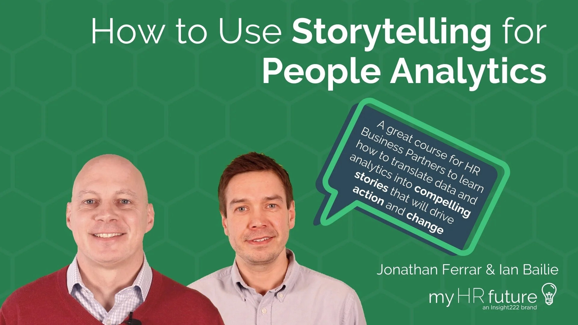
Unlock the power of data-driven decision-making in HR with our curated online course, "How to Use Storytelling for People Analytics." Designed exclusively for forward-thinking People Analytics professionals and HR Business Partners, this course delves deep into the art of translating intricate data insights into compelling narratives that prompt action.
Grasp the essence of effective storytelling, understand its pivotal role in HR analytics, and master techniques to ensure your insights resonate, leading to impactful business changes. Enrich your HR skillset, earn your certification, and stand out as a strategic HR professional. Dive into our comprehensive course offerings, filled with videos, case studies, and real-world contexts. Join the myHRfuture Academy today and be the change-driver in your organisation. Sign Up Now and join the hundreds of other HR professionals in building a data-driven HR future!